Flutter UI Design
Overview
This is my second article in a few days. I completed the design a couple of weeks ago but hadn’t had a chance to write about it until now. This UI is base on a design I found on Dribble. It is a beer menu design with a list of beers and an animation to a details screen.
Features
- this design displays a list of beers that the user can choose from
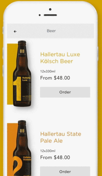
- the list item consists of a particular beer, a color block which matches the beer label, the name of the beer, a size, price and an order button
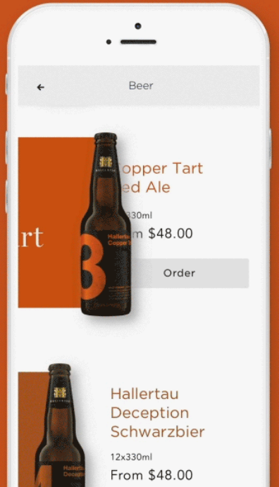
- tapping the beer image triggers an animation that slides the beer to the right while simultaneously expanding the color block. Once the animation ends, the screen navigates to the beer detail screen using a hero animation
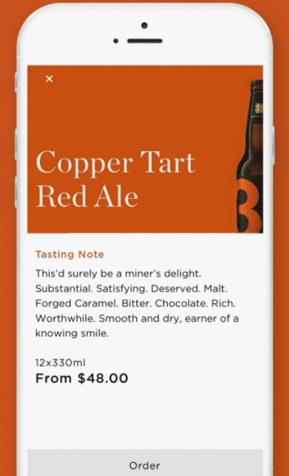
- the details screen displays the color background in the header. It has a large title and the beer image is cropped on the right. Following the header is detailed information about the beer.
- tapping the close icon on the details screen reverses the hero animation and after it ends, reverses the animation of the beer and the color block


Implementation
Creating this design was fun. It was a little tricky getting each individual list item to execute the animation and then execute the hero animation but I managed to make it work.
First I initialized two maps in the initState method. These maps allow each list item to animate independent of each other. For each beer item in the list of beers, I created a controller and animation and stored these in separate Maps. This will be used later.
  Map<int, AnimationController> controllerMaps = new Map();
  Map<int, CurvedAnimation> animationMaps = new Map();

  @override
  void initState() {
	beers.forEach((Beer beer){
	  AnimationController _controller = AnimationController(duration: Duration(milliseconds: 400), vsync: this,);
	  CurvedAnimation _animation = new CurvedAnimation(parent: _controller, curve: Curves.easeIn);

	  controllerMaps[beer.id] = _controller;
	  _controller.addStatusListener((AnimationStatus status){
		if(status == AnimationStatus.completed){
		  _handleHero(beer);
		}
	  });
	  animationMaps[beer.id] = _animation;
	});
	super.initState();
  }
In the build method, I displayed the list using a ListView.builder. For each beer item in the list, I create a custom BeerTile widget. I also fetch the controller and animation from the maps above.
Beer beer = beers[index];
AnimationController _controller = controllerMaps[beer.id];
CurvedAnimation _animation = animationMaps[beer.id];
The BeerTile widget receives the beer item, controller and animation objects retrieved from the maps.
return BeerTile(
  beer: beer,
  isHeader: false,
  animation: _animation,
  onTap: (){
	_controller.forward();
  },
);
The BeerTile widget handles the display of the list item. It also manages the animation that occurs before the navigation to the detail screen happens and the animation that occurs after the detail screen closes. This is done by watching the animation and after it completes, calling the _handleHero method. Because the BeerTile contains a Hero widget, it automatically animates that widget to the detail screen because it also contains a BeerTile. When the detail screen is closed, the hero widget automatically executes the animation from the detail screen and once it completes, the controller reverses the animation of the BeerTile widget.
Future.delayed(Duration(milliseconds: 600)).then((v){
	_controller.reverse();
});
This is all that is needed to perform the sequence of animations in the original design. The rest describes the layout.
As mentioned before, the BeerTile widget is used to layout the list item as well as display the header on the detail screen. It uses a Container to define the height of the widget which is variable depending on the isHeader flag. If isHeader is true, meaning it is displayed on the detail screen, then the Container height is larger.
The child of the Container is a Stack widget which is used to display two Positioned widgets: one for the Hero widget and one for the text and button that are visible when the BeerTile is used as a list item. The Hero widget is where the animation happens. When the animation is triggered, the hero widget’s parent is animated through the use of the right property. The color box, which is just a Container, always uses the maximum width so as the Positioned widget widens, so does the Container. The beer image functions similarly. It just has offsets to allow proper positioning but the animation affects it as well.
Demo
The complete source code can be found here.
The images can be found here.
As always, this is one of many possible ways to design this UI. If you feel this design could be improved, please feel free to leave me a comment.


