Flutter UI Design
Overview
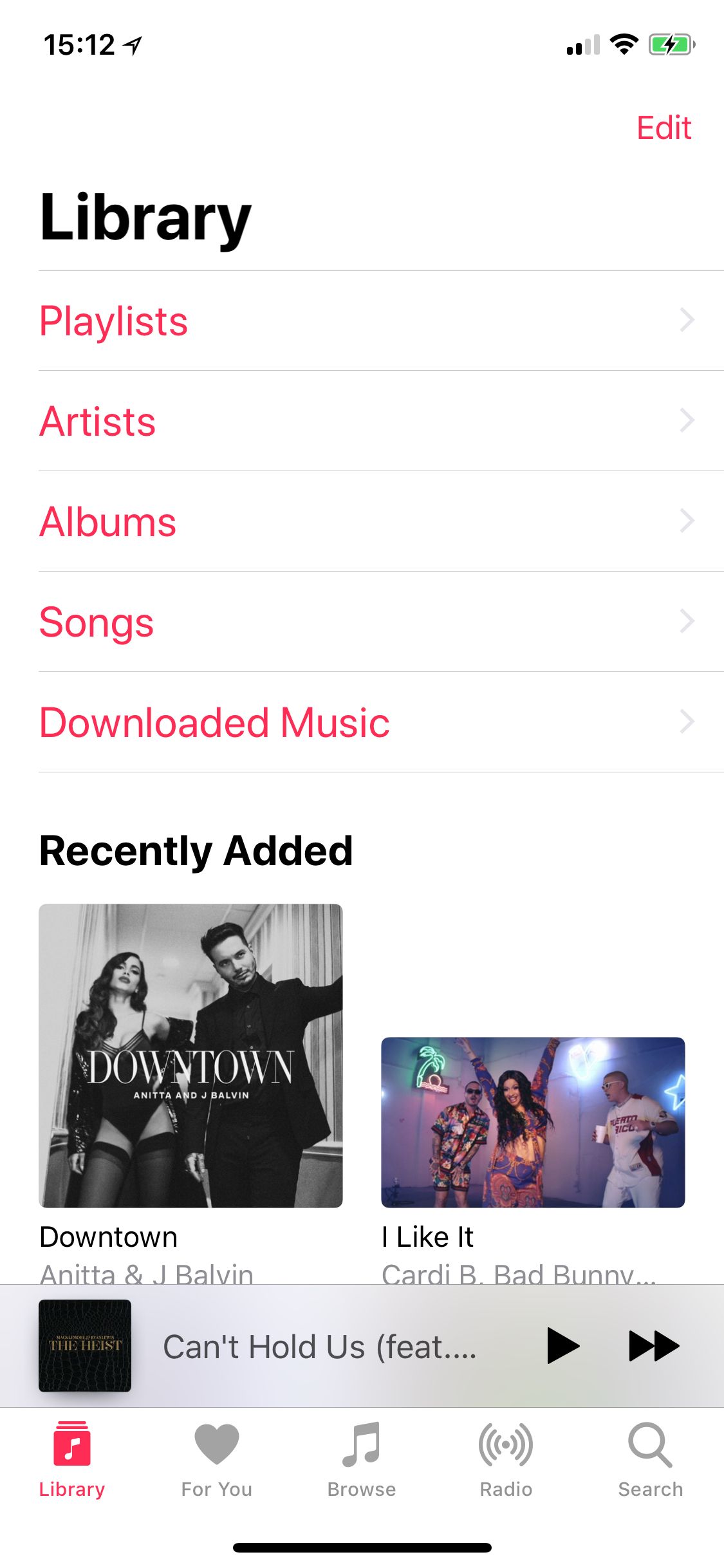
For this design I wanted to recreate a screen from the iOS Music App. I wanted to demonstrate how easy it is to create the various widgets that make up the Library screen and the animation to the Now Playing Details screen.

Features
- The design features a navigation bar with a title and an edit button. The title isn’t always visible though. It only shows when the screen has been scrolled upwards until the screen header is no longer visible. At that point, it fades into view.
- The screen title displayed in large text.
- Following the title is a list of actions for drilling into the library contents: Playlists, Artists, Albums, Songs, Downloaded Music.
- Next, is a list of recently added music. This is a finite number of albums and videos.
- Then there is a Now Playing bar which displays the album cover of the song that is currently playing. It also includes buttons for Pause/Play and Next track. The bar has a translucent appearance.
- At the bottom of the screen is a toolbar for navigating to other screens: For You, Browse, Radio, Search. In this example, buttons are functioning but do not navigate to other screens.
- Last, tapping the album in the Now Playing bar opens a now playing details screen. It shows a larger album cover, a track progress bar, the currently playing track with the artist and album title, controls for managing the current track, a volume control, icon buttons for track actions, buttons to shuffle and repeat, and sections for lyrics and up next.
Implementation
For this design I created a main screen with a Scaffold. I created a standard AppBar with a white background and a 0 elevation. The title uses an AnimatedOpacity to animate the hiding and showing of the title based on the scroll position. For the toolbar at the bottom, I used a BottomNavigationBar and added five BottomNavigationBarItem widgets with icons and text to closely match the original app. The icons aren’t identical but they are close enough for this example. For the Scaffold body I used a Stack and placed as its children, two Positioned widgets. The first fills the Scaffold screen area and is used for the screen that will be displayed when a toolbar item is selected. The second is positioned at the bottom of the screen and is used to display the “now playing” bar over the screen content. The “now playing” bar uses a Row widget to display the album art, title and controls. I wrapped that Row widget in a Container and gave it a white background with a opacity value that made the scrolling contents slightly visible.
For the library screen content, I used a NotificationListener as the child of the Positioned widget. I used it to detect the scroll position of its child SingleChildScrollView. After the position reaches a certain point (52 was the magic number for this example), I execute a simple fade animation to hide or show the title in the AppBar and show or hide the header text. For the actual content I created the series of widgets that make of the scrolling portion of the library screen. The first widget is the title using a Text widget with a large font size. Next is a custom widget used to display a series of CupertinoButtons for the library links and a two column list of album art widgets which represent recently added music. The album art widget uses a Hero widget to animate the transition from the library screen to the now playing details screen. To display the albums, I used a ListView.builder. Because the ListView is a descendent of a Column widget, the shrinkWrap property was set to true so that it doesn't try to take up an infinite height. Also, to keep the ListView from scrolling in addition to the parent, the primary property is set to false.
On the Now Playing Details screen, I use the same album art widget which contains the Hero widget. This allows the animation of the album art during the display of the details screen. The other widgets that follow the album art are:
- Slider for the current track progress
- Text for the track, artist and album name
- CupertinoButton for the playback controls
- CupertinoSlider for the volume control
- CupertinoButton for track actions
Demo
The complete source code can be found here.
The images can be found here.
As always, this is one of many possible ways to design this UI. If you feel this design could be improved, please feel free to leave me a comment.


